
PRESS PLAY / THE NOSTALGIA FILES
You remember a smooth blue waterfall. A modern screenshot gives you a fence of alternating pixels. Neither image has to be fake: the game’s output and the way a display presents it are two different parts of the picture.
Retro games can look different on a CRT because the video connection, television electronics, phosphor pattern and scanning behavior shape the visible image. A modern display or emulator often presents a sharply enlarged pixel grid instead. There is no single universal “CRT look.”
That last distinction matters. A small bedroom television, a sharp RGB monitor and a worn living-room set were not interchangeable windows into the same game. An effect that feels familiar may describe one setup rather than an entire generation.
Start with one scene, not a better-or-worse contest
It wasn’t just the pixels.
Same scene, different feel. Pick a TV look and watch the water and the road.
Fine-tune the picture
A browser illustration, not CRT emulation or a photograph. Real televisions, signal connections and settings produce different results. These controls isolate a few visual ideas.
How it works
The source scene is a fixed grid of original artwork. The study applies adjustable blur, dark horizontal lines and a soft glow. They help illustrate visible differences without modeling a CRT’s electronics, phosphors or a specific video signal.
Reducing all three settings to zero shows the unchanged source in both views. Raising softness blends adjacent details; scanlines add darker horizontal gaps; glow raises the luminous appearance.
The picture lab above uses original artwork so that the comparison has a known source. Start with Crisp pixels. Look at the water’s alternating marks, the narrow road lines and the bright sunset. Then increase softness in small steps. Neighboring details begin to merge, while thin lines lose definition.
The lesson is deliberately limited: visual blending changes what a pattern communicates. The controls do not decode a composite signal, reproduce electron-beam behavior or identify what a particular artist intended. A convincing educational comparison must say where its model stops.
The connection changes the picture before the screen does
An analog video chain is more than a grid sent directly to glass. Different connections carry picture information differently, and the receiving electronics must interpret it. Composite video combines information that other connections keep more separate. Decoding and filtering can change the appearance of fine detail and color boundaries.
The RetroTINK-2X Pro manual provides a useful practical example: its composite decoding options trade horizontal detail against particular filtering artifacts. That is evidence that signal processing matters; it is not a promise that every composite television produces the same blur.
Consequently, “it looked different on my old TV” does not prove that all visible softness came from the tube. The cable, decoder, game output, screen settings and viewing distance all belong in the explanation. Changing several together makes a dramatic comparison, but a poor controlled experiment.
Scanlines are one clue, not the whole technology
The tube itself has a physical structure too. Sony’s Trinitron history describes a three-beam electron-gun system and slatted aperture grille, contrasting it with shadow-mask designs. Those are real differences in the display, separate from a browser’s softness filter. A dark-line overlay alone does not reproduce the tube’s colour-selection structure.
The dark horizontal gaps associated with some low-resolution CRT presentations are easy to imitate with an overlay. They are also easy to overdo. Our scanline slider adds dark lines; it does not recreate a display’s entire light output or motion behavior.
Modern processor documentation makes the distinction clearer. RetroTINK’s firmware notes describe separate controls for simulated beam intensity, mask patterns and filtering. Treating those as separate controls is more informative than calling any one of them an authenticity switch.
A heavy black-line filter can make a picture much darker. If the resulting image loses readable detail, stronger nostalgia styling has not necessarily made it more accurate. The useful question is what property the filter illustrates, and whether the source still remains legible.
Why a bigger screenshot can feel harsher
Imagine drawing a tiny staircase on graph paper, then enlarging each square into a tile. The design has not gained detail; its construction has become easier to inspect. Sharp nearest-neighbor enlargement can have the same revealing effect on pixel art.
Softening that image changes the evidence you see. Small alternations may read as texture or a blended region rather than individual marks. In our original scene the water pattern was deliberately drawn for this experiment. It would be a larger, unsupported leap to claim that every old game relied on exactly that effect.
Proportions matter too. If a modern setup stretches a picture sideways or crops an edge, the mismatch is not just scanlines. Compare aspect-ratio and scaling settings before deciding that a display needs more visual treatment.
A useful comparison you can actually make
Choose one still scene and hold the crop, proportions and source constant. Begin with neutral settings. Change one property at a time, then return to the baseline. Examine a face, small text and a patterned surface rather than only a dramatic sunset.
For our lab, try softness at zero with scanlines enabled, then reverse those settings. One changes the separation between displayed rows; the other blends neighboring details. The difference is easier to understand when the two are not bundled into one preset.
You do not need to buy a television to enjoy that discovery. The valuable part is learning to describe what you prefer: crisp edges, softer color boundaries, a particular mask or a remembered balance of brightness. “CRT” names a family of displays, not a single magic filter.
Sources and further reading
- RetroTINK-2X Pro manual — developer documentation for composite decoding and filtering
- RetroTINK-5X firmware notes — separate scanline, mask and filtering controls
- Introducing RetroTINK-4K — developer explanation of configurable display effects
Keep the field notes
A handy reference for the next time this question comes up.
Open the full-size card ↗Save the PNG ↓
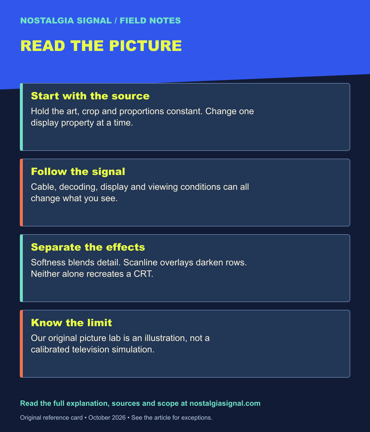
Follow the signal
- Nintendo 64: The Console That Took Nintendo Into 3D — Follow Nintendo’s move into 3D.
- Crash Bandicoot at 30: PlayStation’s Unruly Mascot — Revisit a distinctive low-resolution world.
- Tomb Raider at 30: How Lara Croft Became a Gaming Icon — See how early 3D art became an identity.